Intro
CSS is truly powerful. We can create awesome things using CSS. Here, we will be going to know how to create a triangle using CSS. I hope you will like it.
We all know what a triangle is. As Wikipedia, “A triangle is a polygon with three edges and three vertices. It is one of the basic shapes in geometry.”
Code
Let’s see the code first.
HTML
<div class="container">
  <div class="triangle"></div>
</div>
CSS
.container {
  width: 350px;
  margin: 150px auto;
}

.triangle {
  width: 0;
  height: 0;
  border-width: 150px;
  border-style: solid;
  border-bottom-color: yellowgreen;
  border-top-color: transparent;
  border-left-color: transparent;
  border-right-color: transparent;
}
Output
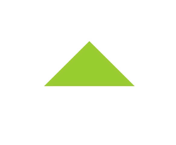
We can ignore the container CSS class. It’s for centering the triangle in the webpage.
The whole CSS code for the triangle is in the triangle class. We removed the width and height and gave width on border-width property. It’s up to you that how much width you need for your triangle. And then the border-style.
But the main part is in the border-color property. If we apply color here, the color will apply to the top, right, bottom, and left sides. And then, it will look like a square. We don’t need this. To achieve our target, we have to put color only one side from those four. And others will be transparent.
It depends on you that which type of rotate triangle you need. For that, you can use: border-{top|right|bottom|left}-color: ‘colorName’. You can experiment with it.
Last Words
That’s all about the CSS triangle. I hope this will help you to create a triangle using CSS.