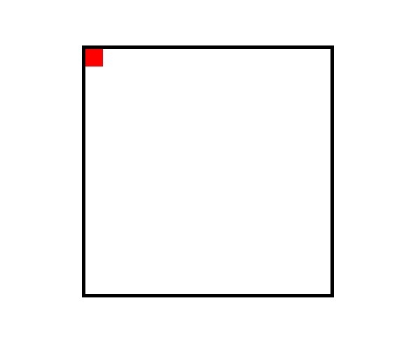
Often we have to center an element vertically and horizontally. We can do this easily using CSS Grid and Flexbox. But it was boring before the advent of CSS Grid and Flexbox. Let’s see an example first.

Suppose we have a container with a black border. Inside this container, we have an element with a red background. But the inside element is not in the center of the container and we want to center it. Before that, see the HTML and CSS code of the above image below.
HTML
<div class="container">
  <div class="element"></div>
</div>
CSS
body {
  width: 960px;
  margin: 100px auto;
}

.container {
  width: 350px;
  height: 350px;
  border: 5px solid black;
  margin: auto;
}

.element {
  width: 25px;
  height: 25px;
  background-color: red;
}
We will use Flexbox here to center this red element. To do this, just add 3 lines CSS in the container class. See the below code.
CSS
.container {
  width: 350px;
  height: 350px;
  border: 5px solid black;
  margin: auto;

  /* Flex CSS */
  display: flex;
  justify-content: center;
  align-items: center;
}
To enable Flexbox, we have to declare display: flex. By using justify-content: center, we center the element horizontally. On the other hand using align-items: center, we center the element vertically.
One thing to remember always checks the height and width before use Flexbox. Container height and width must be bigger than your child element.
If we have more than one element inside the container, both will be center.
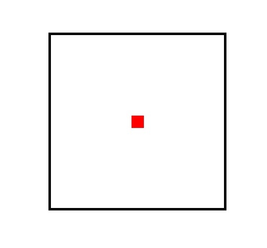
Let’s see our final output.

Centering an element is pretty easy. There are many way to do this. I hope you will find this one helpful for you.
